Design Reviews

Design Reviews

Design Reviews featuring great design, architecture, fashion, graphics and innovation from across the globe.


Nirvana World

Nirvana is a Buddhist term for the transcendence of life and death, which can also be understood as rebirth. It is invisible, but you can feel it, it is both static and dynamic, it is frozen in the moment of rebirth. The work uses photography to express the concept of nirvana nirvana, using the transition between ice and water, together with unreal colors to express the concept of nirvana. Visually, the abstract concept is expressed in the style of Chinese ink painting, which brings people's thoughts into the world of nirvana through the unknown, unreal and moving visual images.

Continue reading

 

Future man

Greengold examines how futuristic presentations can be understood through color and clothing. Since the product mainly expresses the role of brain development, the element of astronauts is also considered. Clothing styles and accessories have also done a synthesis of the above research, using a lot of silver and blue for visual design

Continue reading


Glitters

In this series Glitters, Lau King aims to experiment the irreversible and fascinating nature of sequin fabric and also explore the boundary and diversity of material and texture in the perspective from macro to micro by infusing her personal emotional influence on the ordinary functional object. With the additional human influence on it, the sequin fabric itself becomes a medium for abstract painting. The series is done with an experiment approach with uncertainty factors like fabric, color, lighting and intuition which create mysterious atmosphere by glitters and sparks.

Continue reading


Mother Earth

Mother Earth is a reflection of reality, according to Naseer vision. As a portrait photographer, he decided to capture Planet earth as a human being, who's being sick as a result of pollution. Naseer carefully choose the elements for the make up to represent planet earth in a human form. Naseer tries to show through Planet Earth photograph how planet earth would looks like and feel if it has a human form.

Continue reading


Queen

The extended design is based on the concept of the queen and chessboard. With the two colors black and gold, the design is to convey the sense of high-class and reshape the visual image. In addition to the metal and gold lines used in the product itself, the element of the scene is constructed to set off the war impression of the chess, and we uses the coordination of stage lighting to create smoke and light of the war.

Continue reading


U15

The artists' project takes advantage of the U15 building's features to create an association with natural elements present in the collective imagination. Taking advantage of the building structure and parts of it, as its colors and shapes, they try to evoke more specifics locations like the Chinese Stone Forest, the American Devil Tower, as generic natural icons like waterfalls, rivers, and rocky slopes. To grant a different interpretation in every picture, the artists explore the building through a minimalist approach, using different angles and perspectives.

Continue reading


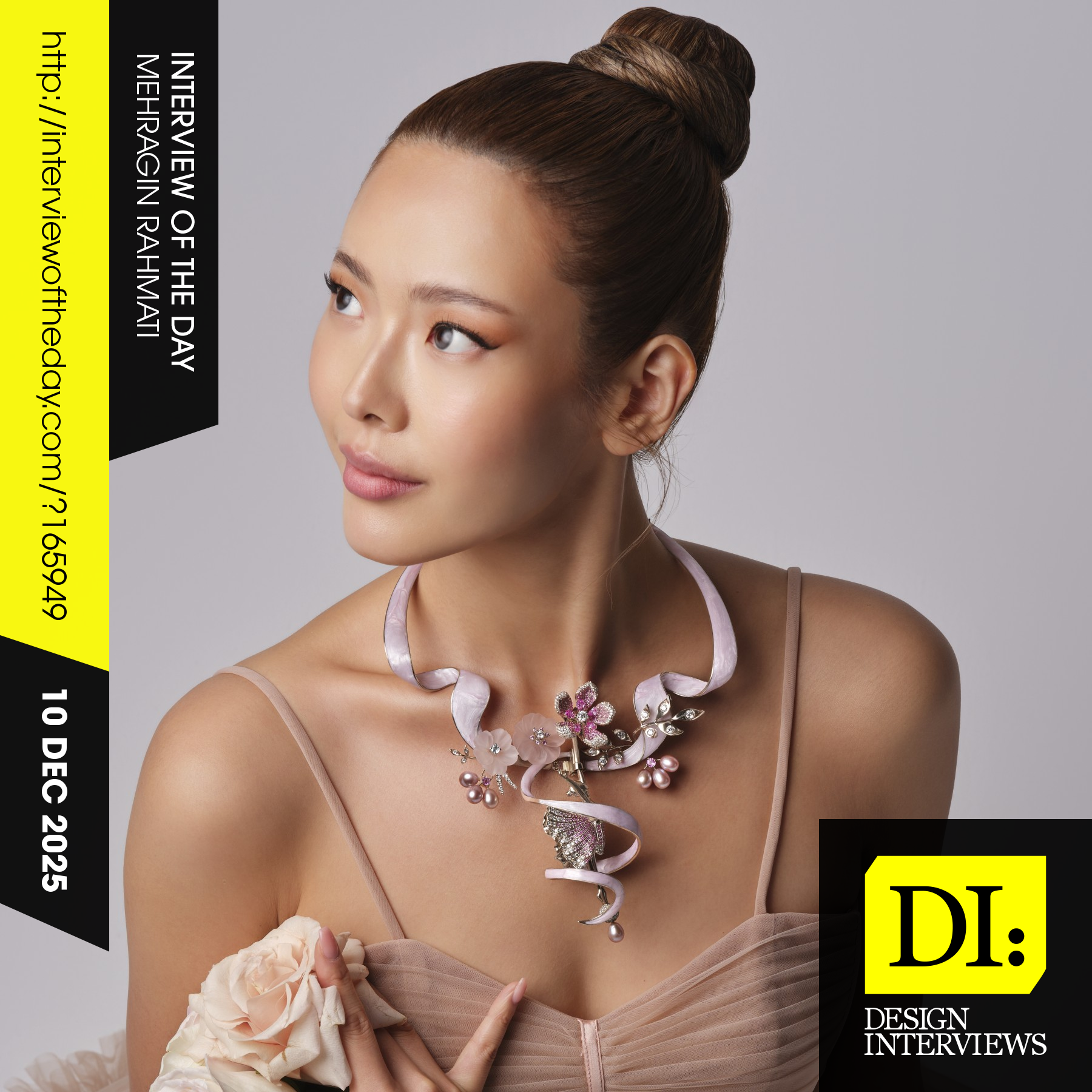
Design interview of the day

Read the latest interviews and conversations on design, creativity and innovation between design journalist and world-famous designers, artists and architects. See latest design projects and award-winning designs by famous designers, artists, architects and innovators. Discover new insights on creativity, innovation, arts, design and architecture. Learn about design processes of great designers.

Continue reading