Design Reviews

Design Reviews

Design Reviews featuring great design, architecture, fashion, graphics and innovation from across the globe.


Problue

The concept of the posters related to Problue brand essence as diving and live. The transition process of clothes in style and diving suit on the same model emphasized the merge of diving and live. As the brand colors, gray blue was applied to gentlemen for elegance and the red was to the lady for charming. The camouflage fins emphasized the fact urban life was as full of movement as in nature. Different contrast were made on purpose to enhance visual experience, for example, fast and still, daily wear and diving suit, smooth and sharp, hero look and elegance.

Continue reading


Open your eyes

The stylistic device of the photography series is the plastic wrap, which is normally used by a painter. As seen, in that case it creates human or animal figures with wind and it's resistance. Which character is seen, depends on the viewers mind, therefore the title of the project is "open your eyes". Michael Liebert is a photographer who wants the viewers of his pictures to create shapes and figures for themselves. For the photographer the most helping resource is the viewers imagination because it has no limits.

Continue reading


America Heartland

America Heartland is a series of photography taken in a commercial aircraft at the moment of landing in American Midwest. It captures the geometric abstract patterns in snow-covered corn fields and roads from an unique perspective to attain a sensibility of the Sublime, celebrating the dynamic energies that brings vitality to America heartland.

Continue reading


Opal Nera

The idea of this photograph was born starting from the minimal and modern design of the bottle. The opaque glass and the liqueur with a purplish dominant articular allowed to imagine a play of lights that would allow the enhancement of the whole. The combination of black and purple bring back both the name of the product and its nature. The smoke that envelops the scene refers to a feeling on the border between mystery and magic.

Continue reading


Food in Nature

This project is for the new menu of a restaurant in Ho Chi Minh City, Vietnam. First, the inspiration came mostly from the origin of culinary art. Answering that question "Where does the food come from?" the final idea is about how food should connect closely to Mother Nature. "Food, flowers and stones" is a returning journey to mother nature, which captures the moment of fragile flowers growing from arid stones. By illustrating nicely-styled dishes in the beauty of nature, the project gives a touch of survival and growth.

Continue reading


WoodBergs

These images represent details of sections of trees felled to be transformed into something else. The use of negative inversion and direct printing on aluminum enhance the colors and the concept of destruction of our planet. The artist is inspired by artistic photography and environmental rights, transforming details of nature and flora: photographic technique and rights merge into surreal images to lead the viewer to reflect on what can be done to safeguard the planet. A better world is possible, it also depends on you.

Continue reading


Amazing design. Good design. Best design.

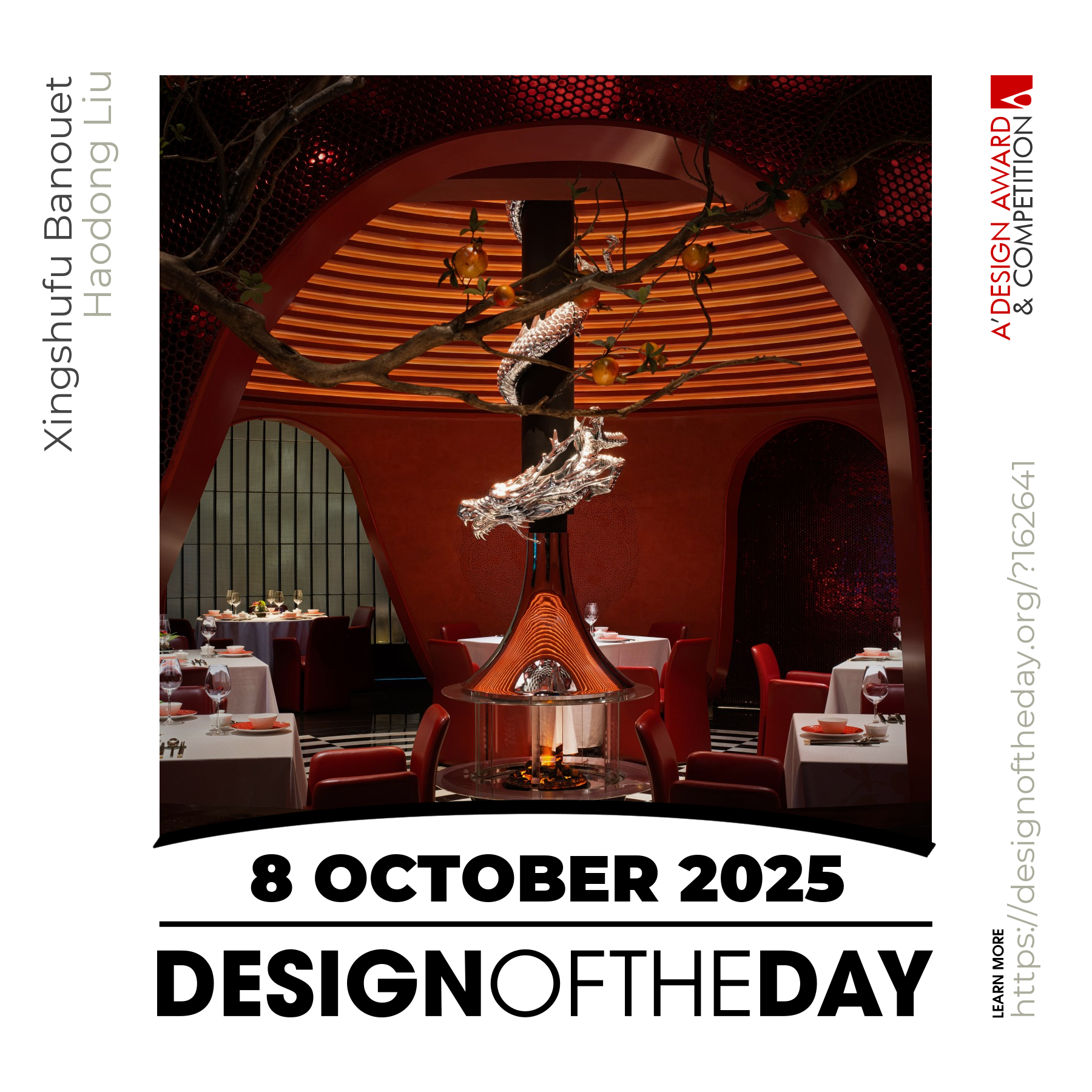
Good designs create value for society. Everyday we feature a special design project that demonstrates excellence in design. Today, we are pleased to showcase an award-winning design that makes a positive difference. We will be featuring more great and inspiring designs daily. Make sure to visit us everyday to enjoy new good design products and projects from greatest designers worldwide.

Continue reading